

California Lottery
A Reimagined Experience for All Players
The Challenge.
California Lottery’s web platform was in desperate need of a refresh to provide players with a more modern and engaging experience that also met state mandated accessibility standards. However, this project was much more than updating the look and feel and adding a few aria tags, there were deep rooted experience issues. As the UX lead, I identified three main problems that needed a solution.
Accessibility
My skills were put to the test on this project as I realized I had only scratched the surface of true accessibility. As a state agency California Lottery was required to comply with California Government Code, strictly meet WCAG 2.0 Level AA guidelines and be certified for compliance before the mandated launch by date of July 1, 2019. As a lottery site, the clients’ deep love of all things flashing and bright made meeting that standard particularly challenging.
Information Architecture
California Lottery was maintaining two separate websites, one for the player and one serving as the more public face of the lottery. This approach made it easier to meet regulatory standards but created a disjointed experience that was difficult for users to navigate. Additionally, maintaining two separate sites increased the burden on content authors. Creating a single site experience required balancing engaging content for players while still meeting regulation.
Responsive Design
The existing California Lottery sites were not responsive despite receiving 60% of their traffic on mobile devices. In an industry that runs on engagement, they were missing out on huge opportunities to connect with players. I approach all projects with a mobile-first mindset, but California Lottery’s frequent use of large complicated tables and regulatory mandated disclosures required a more thoughtful solution.


The Approach.
Research
Before I did anything, I needed to understand the current state of both sites, business objectives, who the users were and how they used the sites. I gathered information using the following activities and synthesized my findings into recommendations that steered the project’s next phase.
Performed a heuristic analysis on each site to assess current state
Lead stakeholder interviews to understand KPIs and site requirements
Created user flows with existing personas to understand how users achieved their goals and identify ways to improve their experience
Reviewed site analytics to validate qualitative research and gain additional user insight
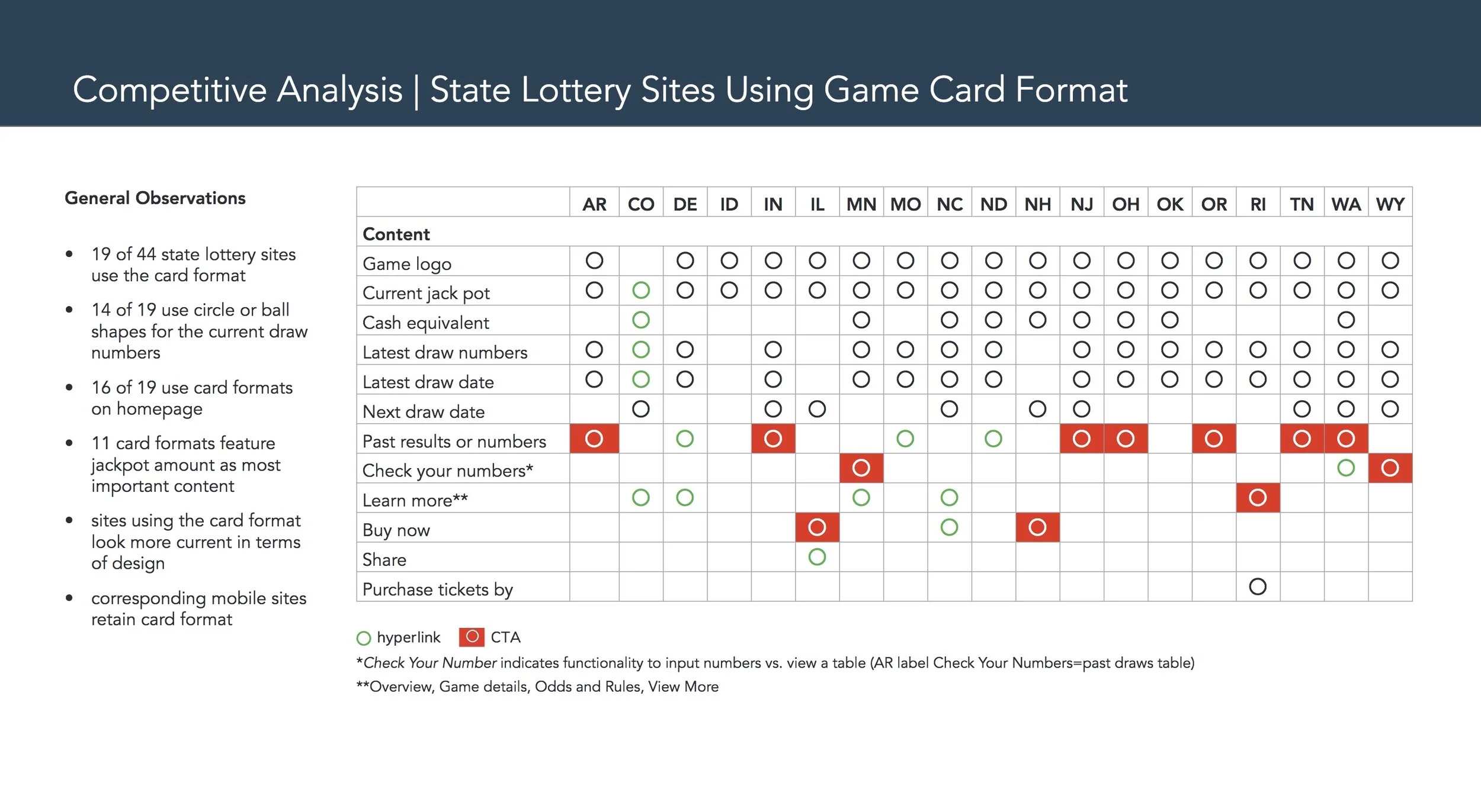
Conducted a competitive analysis to better understand the lottery industry and see how other states approached accessibility (spoiler alert, they weren’t)
Content Strategy & Information Architecture
Creating a cohesive site from two very different experiences required evaluating the current state, understanding regulations, reimagining California Lottery’s approach to copy and designing an intuitive navigation. My process included:
Conducting a content inventory and content audit on both sites
Using site analytics and research to inform which content should be removed, consolidated or rewritten
Identifying how to group and label content to match players’ mental model
Working through site map iterations to create an easy to navigate site that aligned with regulations
User Experience & Design
Design sprints facilitated the cadence my team needed to meet the state mandated launch by date. As the UX lead, I identified which pages would be included in each sprint based on priority and development complexity. Working in close collaboration with visual designers, business analysts and developers we created over 40 wireframes and final comps.
Making the Complex Simple
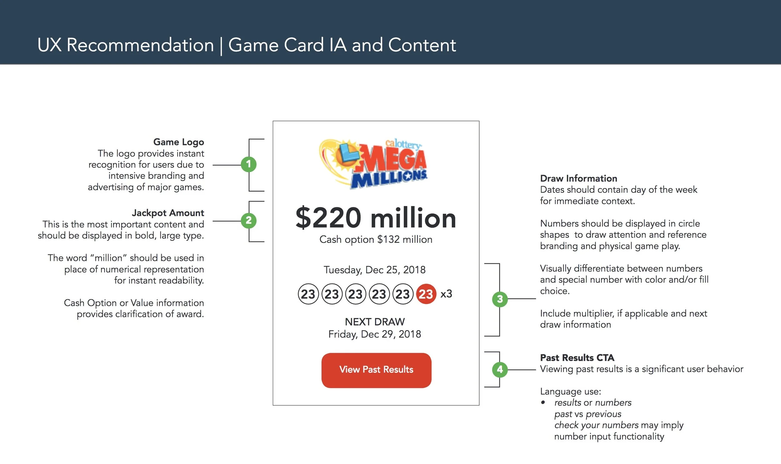
Checking draw game results and draw times are the top reasons users visit calottery.com. Draw Games are woven throughout the site so achieving a cohesive experience was incredibly important. Additionally, the Draw Games page receives the highest amount of mobile traffic, so responsive design was key.
In order to quickly provide users with the most important information, I designed cards to improve scanability and increase engagement. Content included on the cards was based on research, but complicated by legal requirements. Balancing user needs, regulations and accessibility standards in a responsive experience… how hard could it be? Oh, and there were different states depending on the time of day that varied by game. (This is a great example of why validating requirements is really important).
I explored other layouts, but nothing seemed right or create the cohesive experience of the cards. It took a lot of sketches, user flows and wire iterations, but I’m happy to report the cards in all their complexity are a core part of today’s experience on any device.
Accessible Designs Are More Usable (and can be fun too)
Hot Spot is an important piece of the player engagement model. And at the time, could not have been any less accessible. Automatic page refreshes every 4 minutes and a color changing 80 ball grid were the stars of the page, but also the biggest offenders.
Simply adding a pause button, wasn’t enough to address the functionality and there was no specific WCAG for this exact situation. I reached out to accessibility experts and hunted through endless documentation to piece together a solution. Heavy on very specific requirements, I worked closely with our BAs to make sure each detail was documented.
I consider creating the new Hot Spot experience one of the defining moments in my career. It made me look beyond a check list of accessibility criteria and design a fun and engaging experience for all.


The Results.
Better Experience for Users and Authors
A transformed user experience consolidating two legacy sites, and a revamped content strategy to simplify the UI and minimize content management for the business and marketing teams.
Accessible on Any Device to Anyone
An optimized, fully responsive experience designed, built and certified to meet WCAG 2.0 AA. Updates are currently underway to meet WCAG 2.1 standards.